Work
Archive
About
Resume
Work
Archive
About
Resume
Hana Choi
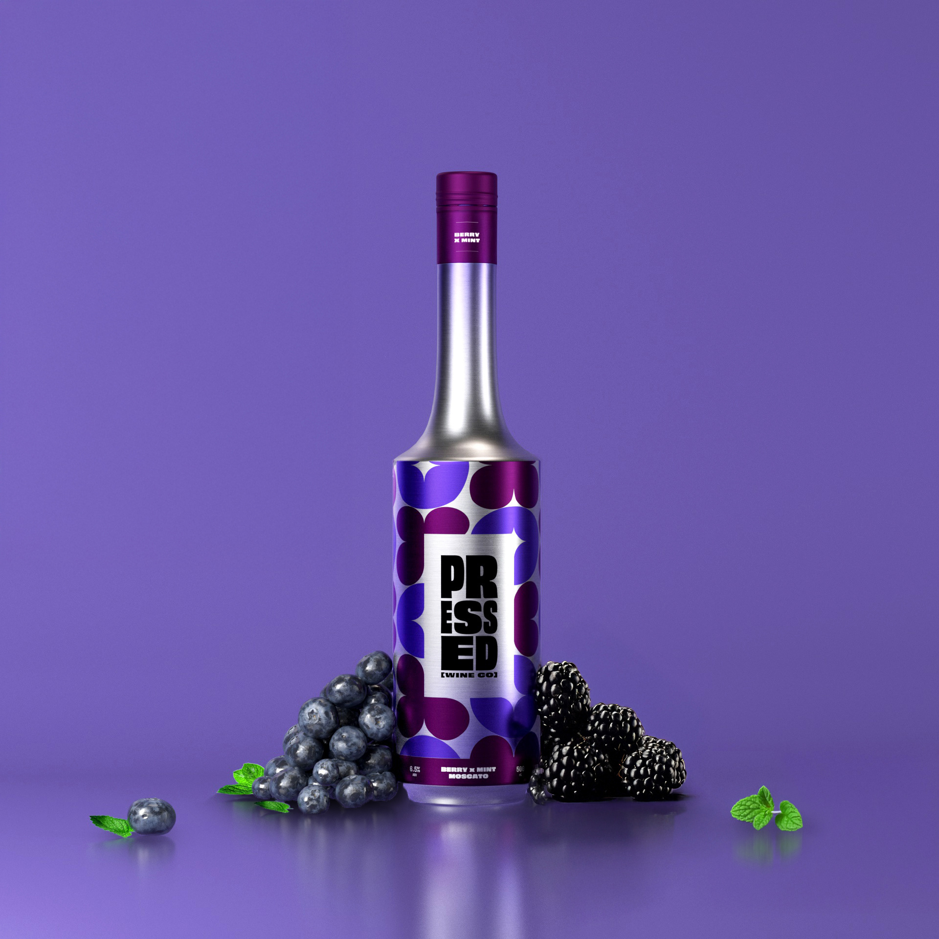
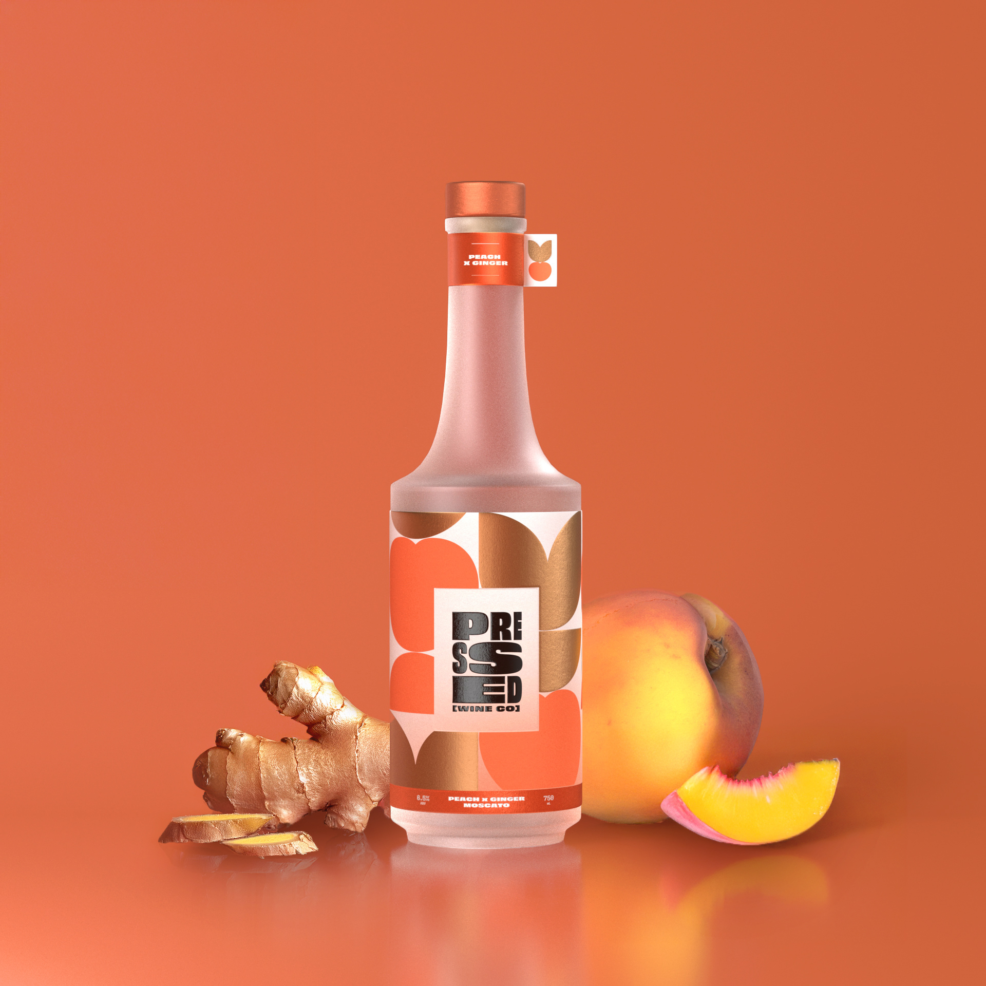
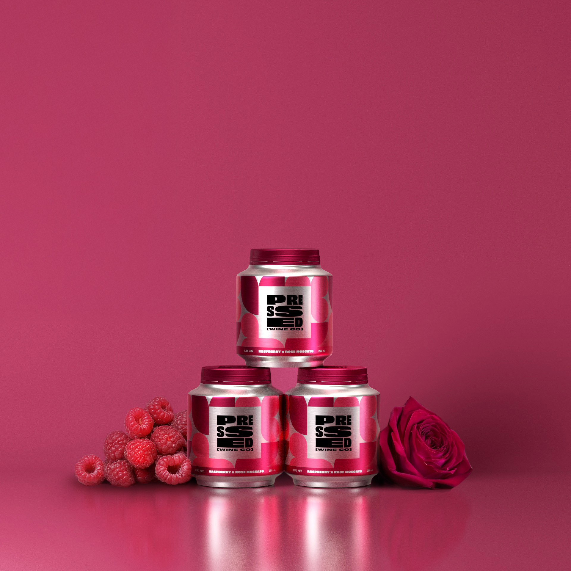
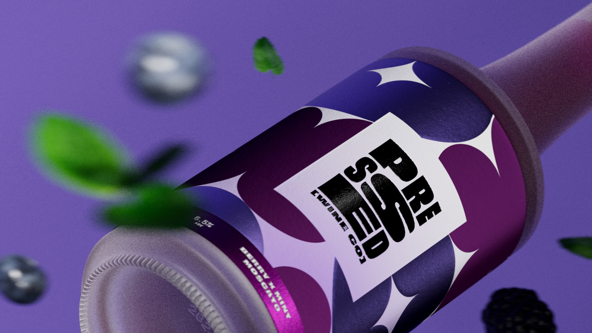
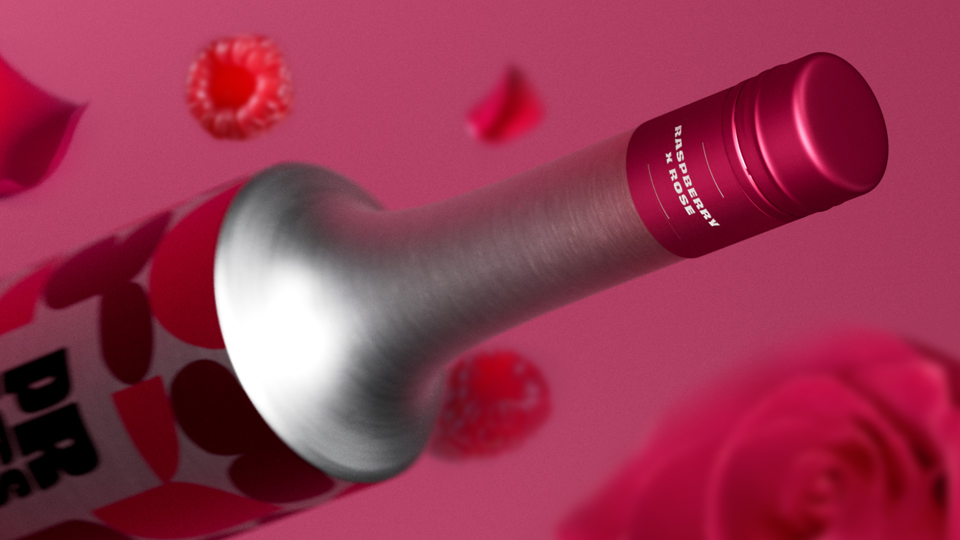
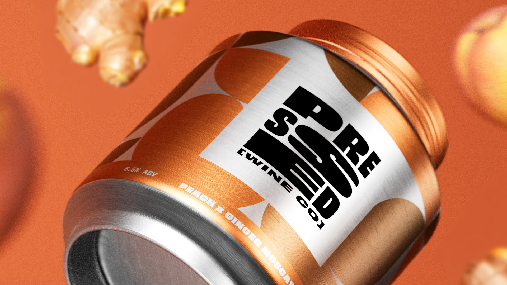
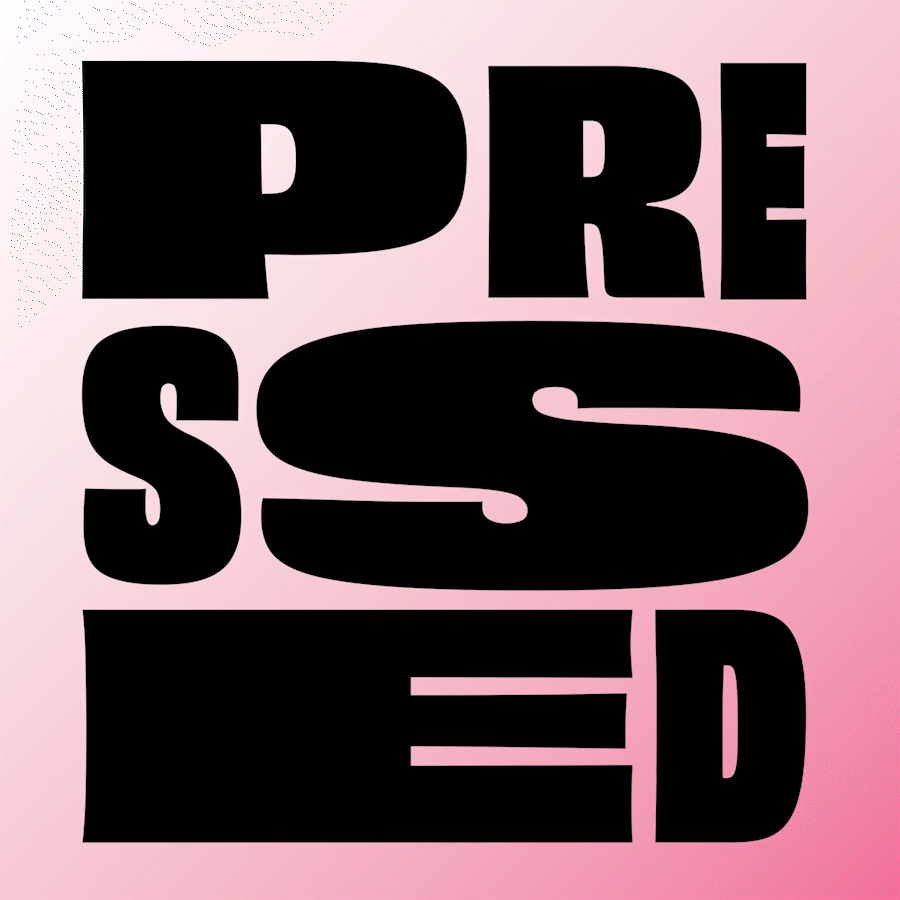
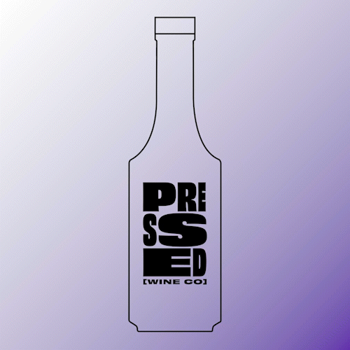
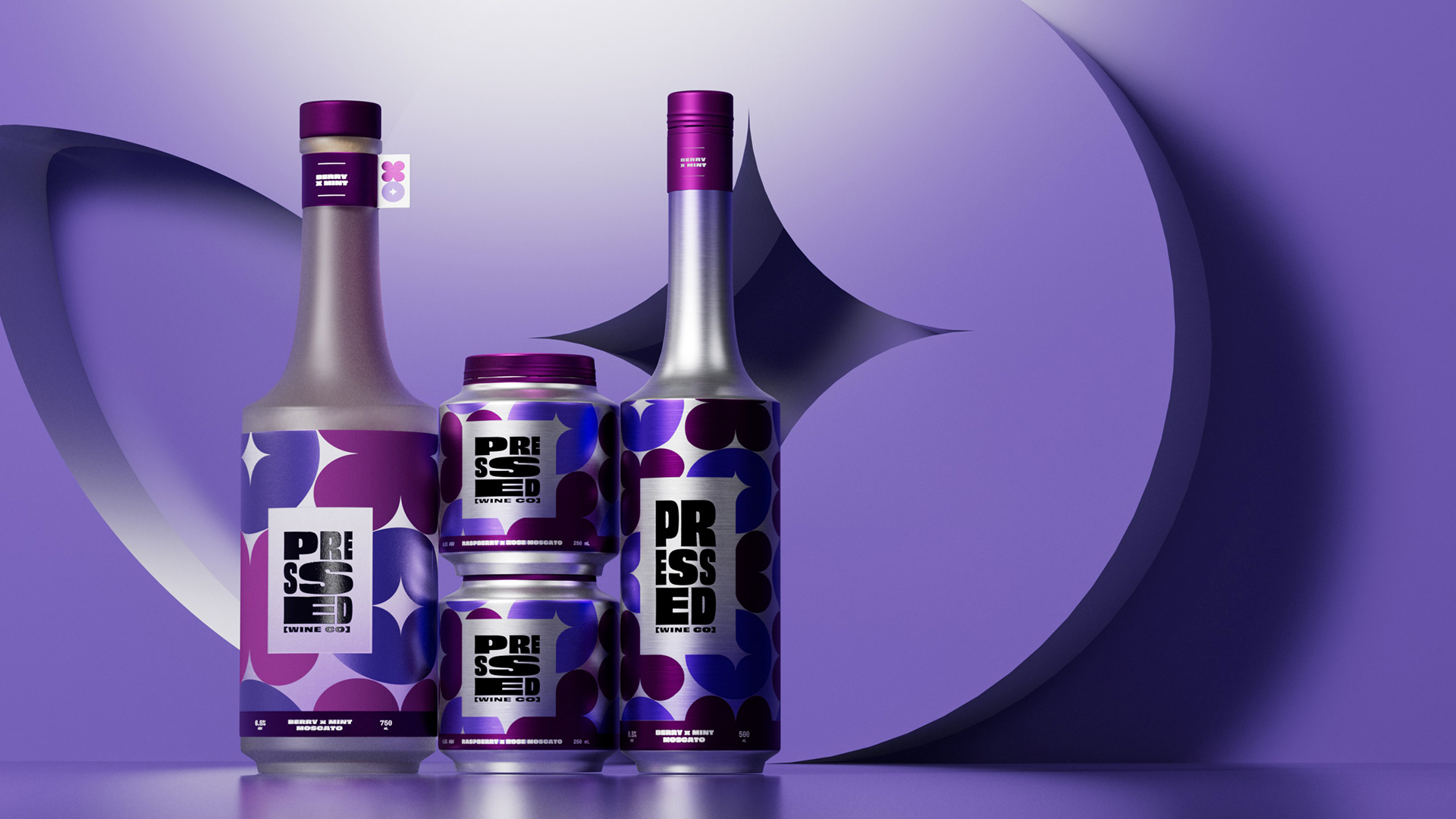
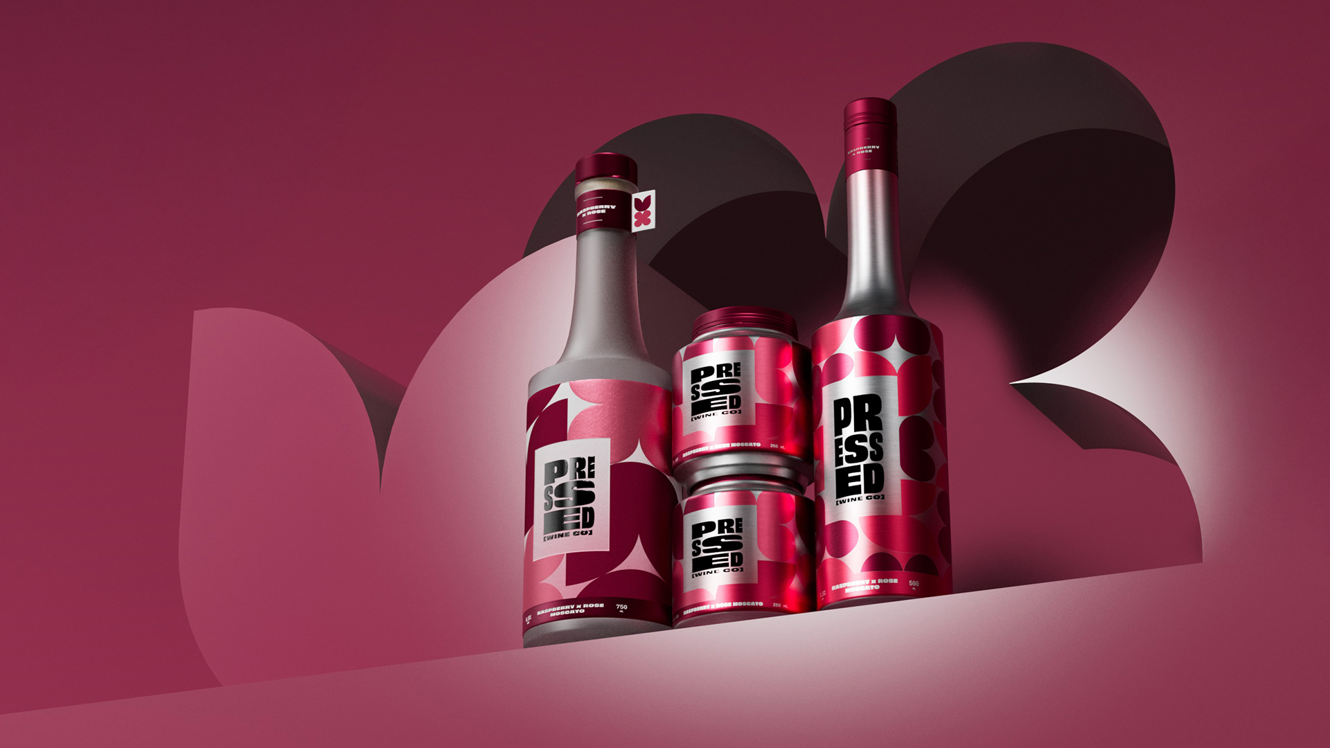
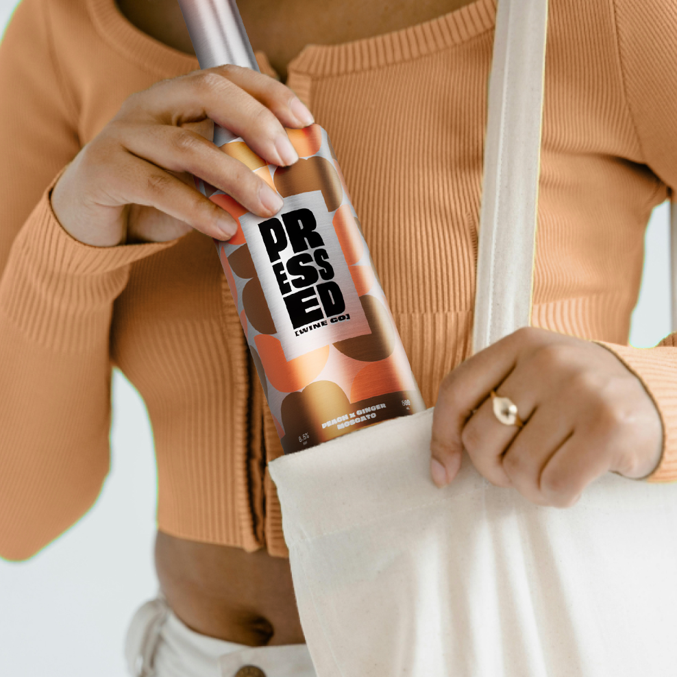
Pressed Wine Co.
Packaging, 3D Visualization, Logo Animation
You may also like
Contigo
2025
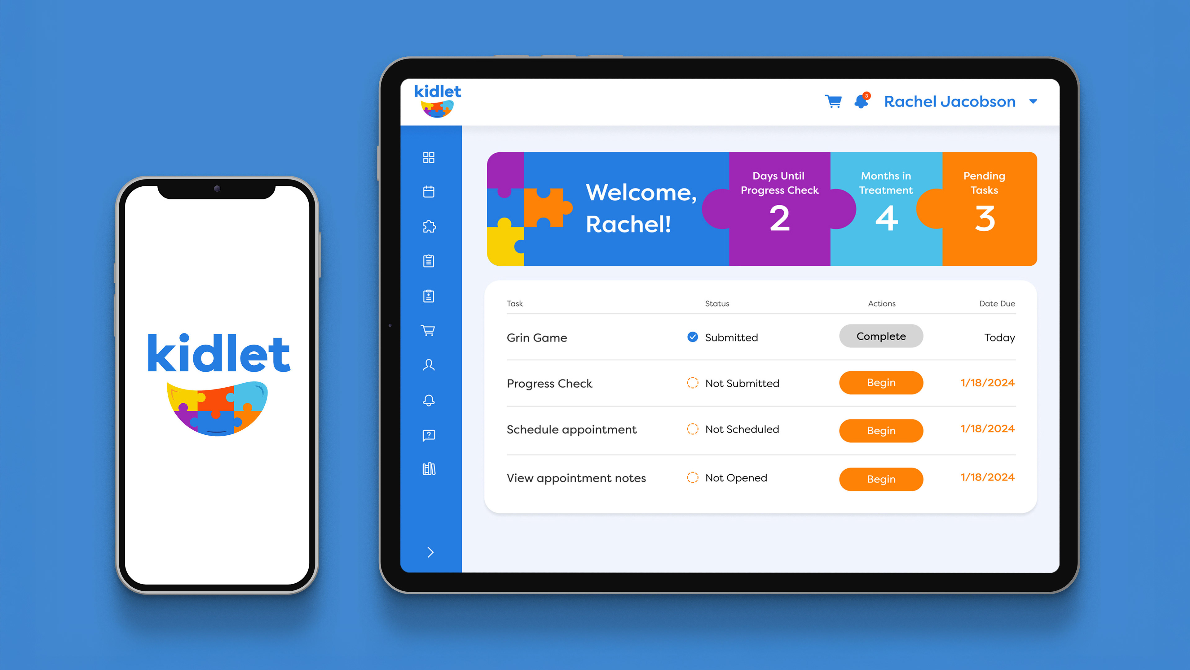
Kidlet
2025
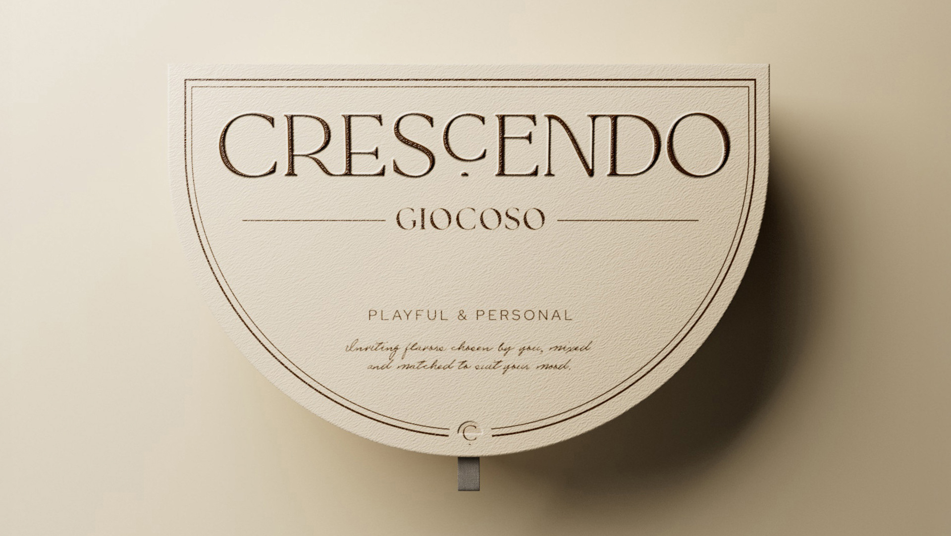
Crescendo
2025
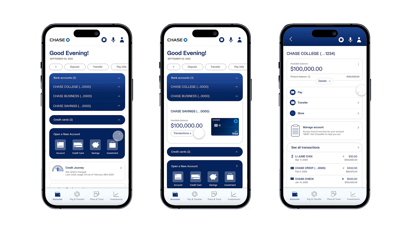
Chase Bank Redesign
2023
Koco Sparkling Tea
2024
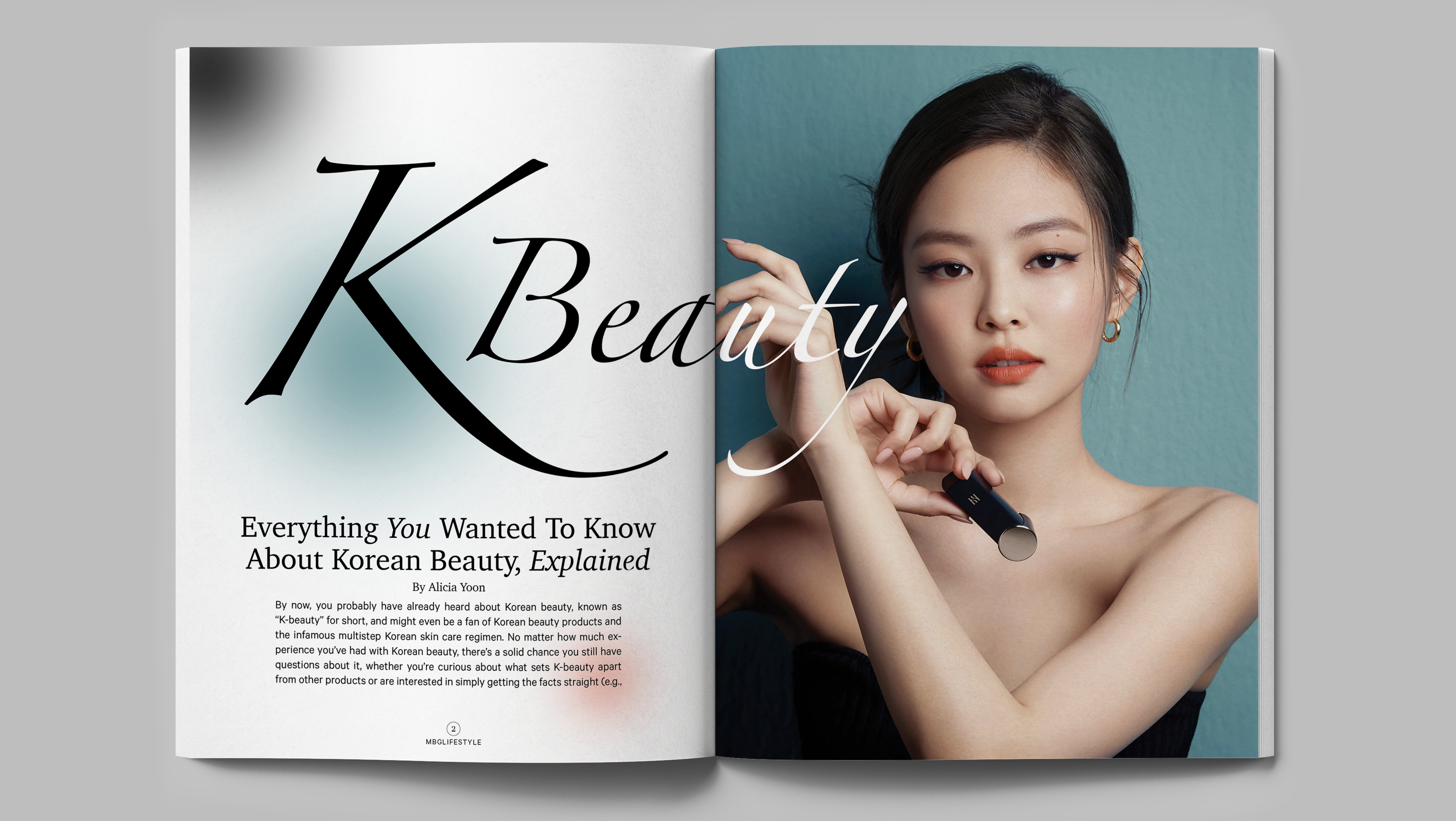
K Beauty Magazine
2022
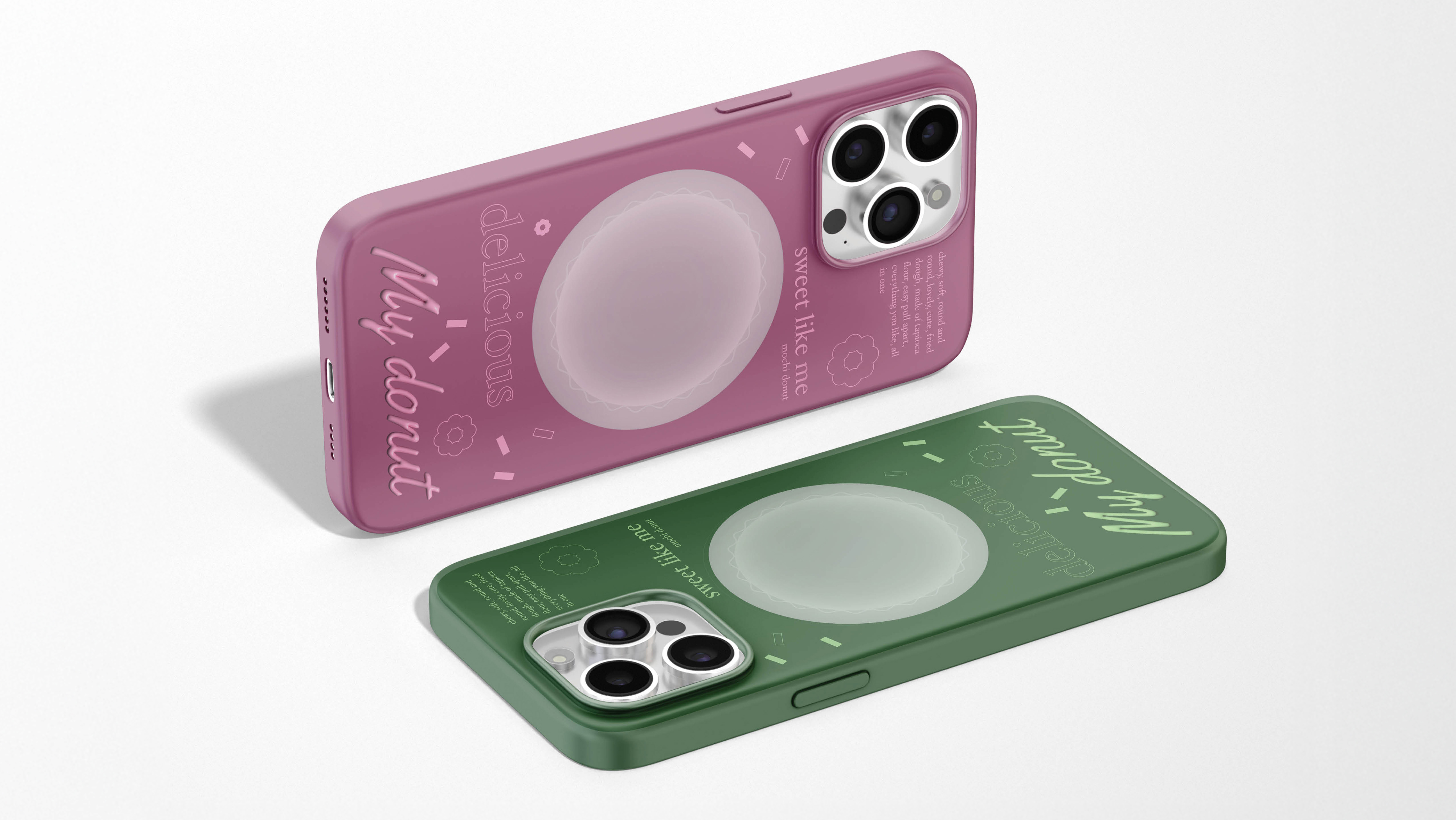
My Donut
2023
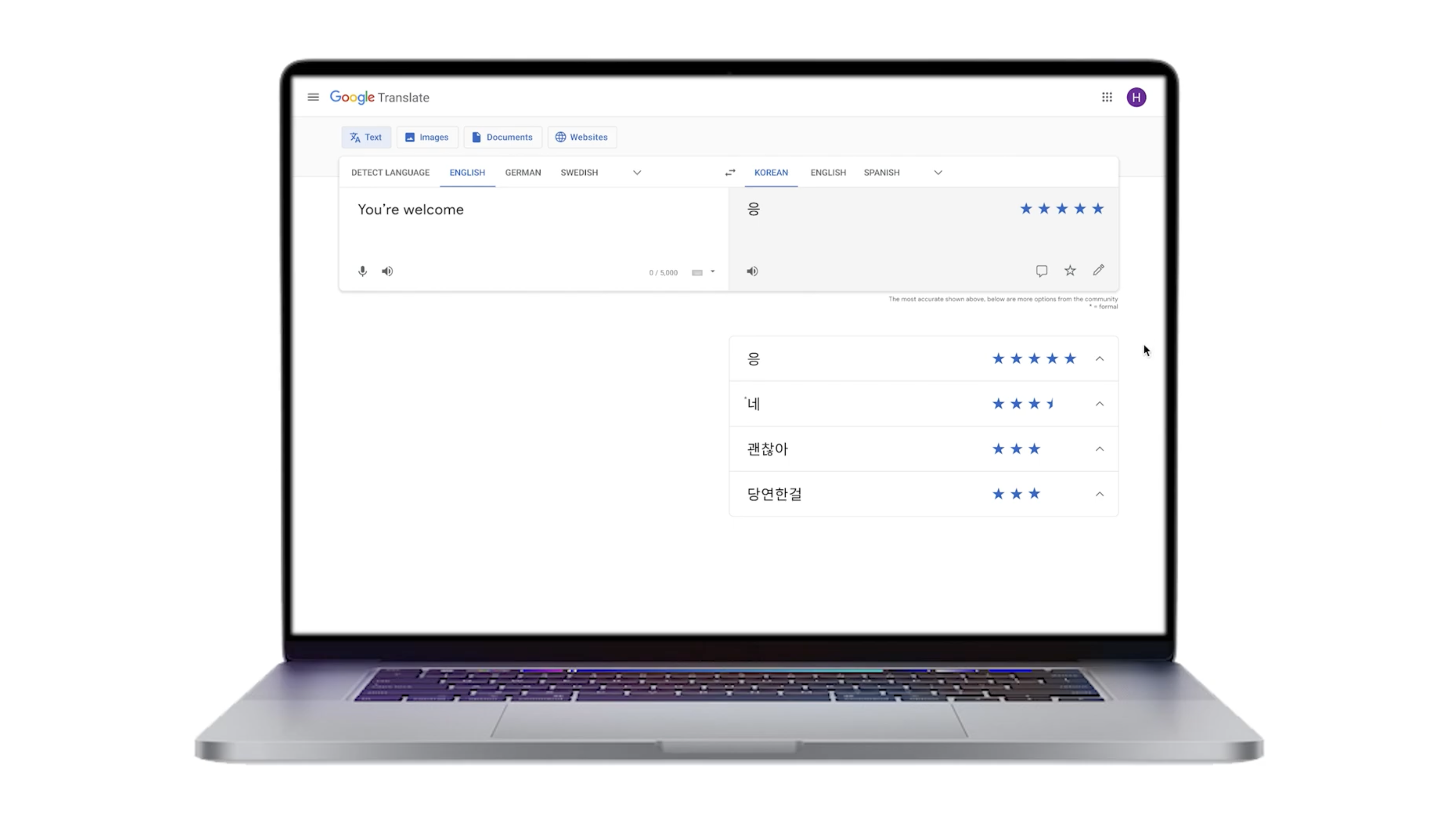
Google Translate Redesign
2022
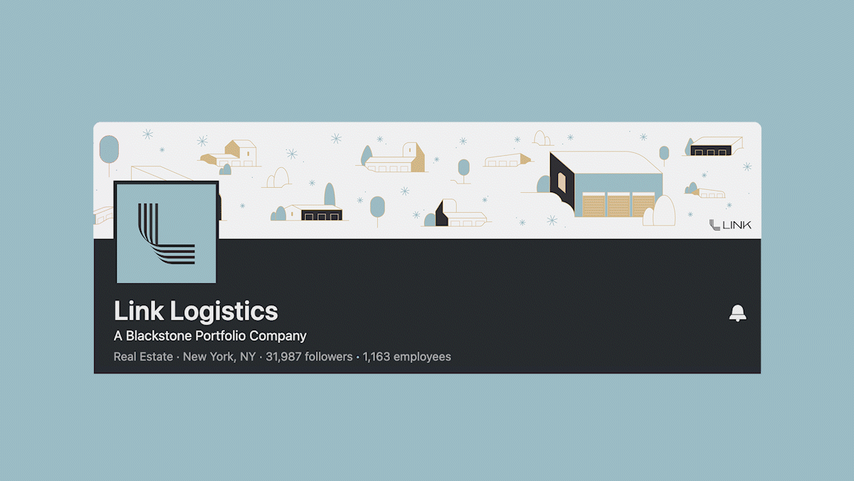
Link Logistics
2022
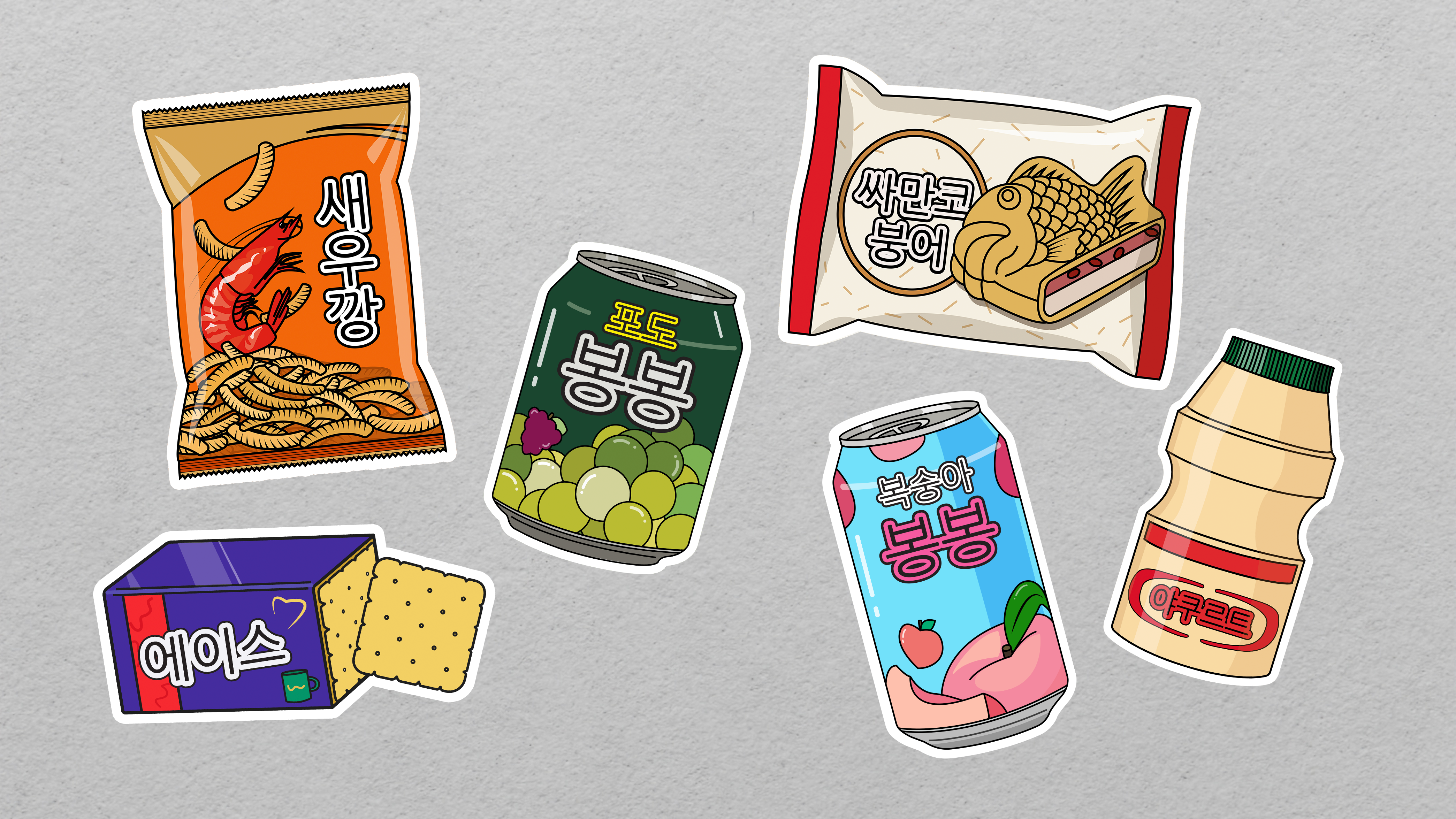
Korean Snack Illustration
2020
↑
Back to Top